Vanetines Day — Valentine's Day Photo eCard

Vanetines Day

Valentine's Day Photo Card

More personal than any store-bought card.

Free · No account needed

A delicate Valentine's Day card featuring golden script and heart motifs, with a blush-pink watercolor background and elegant floral illustrations.

Create This Card
Photos fall out like real prints
Full-quality photo downloads
Keep forever as an offline file
Free, no signup needed

See What Your Recipient Gets

Your card opens just like a real greeting card — add photos on the left, your message on the right, or simply send a heartfelt message

Vanetines Day — inside right
Your Message Area Greeting + Message + Signature
Vanetines Day — card cover
Vanetines Day — inside left
Photo Area Add up to 15 photos

Add photos for an extra surprise, or send just a message — it’s your card

Free to createNo account requiredPhotos fall out like real printsFull-quality downloads

Photos Fall Out

Photos tumble out of the card like real printed pictures

Print Quality

Download every photo at full resolution

Keep Forever

Download the card to keep offline forever

Free, No Signup

Create and send without an account

How It Works

1

Choose a Design

Pick from hundreds of free templates

2

Add Your Photos

Upload photos from your device

3

Write a Message

Add a personal note to your card

4

Send Instantly

Share via link — text, email, or WhatsApp

About This Design

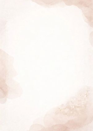
The card opens on a blush-pink watercolor background that fades from pale rose at the edges toward a softer cream at the center. Golden script lettering runs across the face of the card, and small heart motifs sit between the words. Illustrated roses in muted pink and gold line the lower and upper borders, drawn in a style that keeps things light without being busy. When the card opens and the photos fall out on screen, the warm gold-and-blush tones around them read quiet and intimate — not loud, just calm.

This card suits two kinds of people well. First, your partner of several years who doesn't need grand gestures but who still opens every card you send — the understated gold-and-blush palette won't feel over-the-top, and the floral borders give it enough care that it doesn't look rushed. Second, your mum who always made a big deal of Valentine's Day when you were growing up and still sends you a card every February — she'll recognise the roses and the golden script as genuinely considered, not an afterthought pulled together in five minutes.

For photos, lean into the cream and blush tones already in the design. A candid shot of the two of you at dinner, taken on a phone with warm restaurant lighting, will sit naturally against the watercolor background. A close-up of flowers you actually gave or received — even a quick snap on a kitchen table — adds something personal without needing to be a professional photo. If this is for your mum, an old family photo scanned or re-photographed works well here. Recipients can tap any photo to download it at full resolution and keep it, which is the real point of sending photos this way.

Similar Valentine's Day Cards

View All

Frequently Asked Questions

Are there situations where this card would feel like the wrong choice for Valentine's Day?

Yes — if the relationship is brand new and you're not sure how the other person feels, the golden script and rose illustrations read as fairly serious. Sending this to someone you've been on one or two dates with could come across as more intense than you intend. It also doesn't land well as a humorous or ironic Valentine, because nothing in the design signals playfulness. If you want something lighter or more casual, this particular card will work against you.

How do I choose photos that won't clash with the blush-pink and gold color scheme?

Photos with warm or neutral tones sit best here — think golden-hour outdoor shots, indoor photos taken under warm lamp light, or anything with soft natural backgrounds. Avoid photos dominated by cool blues, bright greens, or heavy shadows, because those colors fight the blush-and-cream palette rather than sitting alongside it. You don't need to edit your photos; just pick ones where the overall light already feels warm. A snapshot taken near a window in the afternoon usually works well.

Does the tone of this design suggest I should write a long message or keep it short?

Short works better here. The golden script and floral borders already carry a lot of visual weight, so a long block of text will feel crowded against them. Two or three sentences — something direct and specific to the person rather than a general sentiment — fits the mood of the design. Think of it as a note, not a letter. If you have a lot to say, say one thing well and let the photos you've included do the rest of the talking.

Could this card work for a wedding anniversary rather than Valentine's Day specifically?

Reasonably well, yes — the roses, gold lettering, and blush palette are not tied to February in any obvious way. Nothing on the card says "Valentine's Day" outright, so sending it for a first or fifth wedding anniversary reads naturally. It would feel slightly out of place for a milestone like a 25th or 40th anniversary, where something with more weight or formality might suit better. But for earlier anniversaries between two people who liked the romantic register to begin with, it holds up fine.

Make Their Day Special

Free, no account needed. Ready in minutes.

Create Your Card Now
Create This Card